Luen Wo Hui is a district on the eastern edge of Fanling. It would originally have been separated from Fanling town centre (the area around the railway station), but the area in between has since been filled by village houses. The centre of the district consists of narrow streets filled with shops and restaurants, but in the last couple of decades, it has expanded to include six high-rise housing estates.
Two of these estates are distinctly low-end, judging by the architecture of the blocks and the fact that there are only small shopping arcades at ground level. However, the other four estates all incorporate shopping malls (to qualify as a mall, there has to be a central atrium).
Three of these malls—Belair Monte, Regentville and Green Code Plaza—are interlinked by footbridges, but the fourth, Union Plaza, is separated by a significant distance from the other three and is thus completely self-contained. It is in fact immediately adjacent to the old centre of Luen Wo Hui.
What follows is a tour of the mall, focusing on the patterns in the floor tiles. I featured the tile patterns in Regentville as part of Tile Styles, and I hinted at the complexity of the floor patterns in Green Code Plaza in The Corridor of Uncertainty. However, unlike the more complex but uniform patterns in Regentville, the tile patterns in Union Plaza are irregular, albeit less complex.
There are three entrances to the mall. This is the one next to the centre of the district that I referred to above:
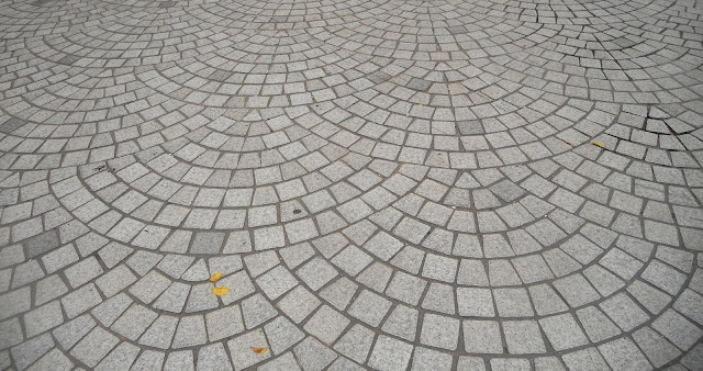
You will see this pattern of overlapping concentric arcs of outdoor tiles as you approach all three entrances:
And this is what you will see immediately you enter the mall:
The main tile colour is light brown, but there are a variety of arrangements within this scheme in which a ‘ring’ of blue tiles surrounds black and white tiles. The ‘tree’ that is surrounded by a ring of pot plants reminded me immediately, when I went to take the photos for this report a few days ago, that we are in the run-up to Chinese New Year. I was disappointed, because I knew from an earlier visit that it concealed an eight-pointed star that has been constructed from polished stone rather than tiles (eight is the lucky number in Chinese culture).
…and this is the tile pattern immediately inside the entrance:
…although it’s partially concealed by the mat, which is there, presumably, so that people can wipe their feet.
There is a smaller eight-pointed star at the top of the escalator leading to the mezzanine floor:
The mezzanine floor consists of a gallery around the central atrium, and the standard tile pattern appears to be concentric squares of blue, white and black.
There was a Chinese restaurant on the left the last time I visited, and I’ve no idea why it has closed. ‘Competition from other places’, to quote Dire Straits’ Sultans of Swing. Paula and I never visited, because we’d been going to Sun Ming Yuen in Green Code Plaza for yam char even before the restaurant moved to its present location.
Did I just write ‘standard tile pattern’? Around the first corner, the arrangement changes:
And this is a view of the central atrium from approximately the same location as the previous photo:
Notice the brown/white chequerboard pattern behind the escalators (there is a closer look below).
Although I couldn’t get an uncluttered view of the eight-pointed star, I still took a photo from the gallery:
The ‘tree’ is a peach, which is the Chinese New Year equivalent of the Western Christmas tree (the peach is the symbol of longevity in Chinese culture). The various pot plants surrounding the tree include miniature orange trees (the symbol of prosperity) and a variety of flowers. The yellow flowers are chrysanthemums, but I cannot identify the others, or explain their significance. Perhaps they’re there simply because they look nice.
You will also notice that the star is surrounded by an obviously irregular hexagon. This is a photo that I took last year that shows just how irregular the hexagon is:
The third and fourth sides of the gallery mirror the tile patterns on the respective opposite sides:
You may have spotted that the tile pattern next to the entrance (above) differs from that on the mezzanine floor (blue/white/black rather than blue/black/white). It would seem that this is a uniform distinction between floors, because this is a photo of what it looks like underneath the gallery:
The entrance through which we came earlier can be seen on the top left.
And this is a closer look at the chequerboard pattern behind the escalators:
As you can see, it is highly irregular in the context of its surroundings, but irregularity appears to be the plan here.
Two of the three entrances to the mall bring you immediately into the central atrium, but if entering or leaving through the third, you have to walk along a short corridor:
The first photo was taken looking away from the atrium, while the second was taken from the entrance, looking back. To confound, yet again, my expectations, the first photo shows a blue/black/white arrangement of the tiles, but given the irregularities that I’ve pointed out so far, I shouldn’t have been surprised.
And that’s the state of this union, which, despite the irregularities I’ve pointed out, is in better shape than that other union, which, despite the recent claims of its leader, is in a bit of a state.
Tuesday, 4 February 2020
Subscribe to:
Post Comments (Atom)


Designer's work of setting tiles may often be overlooked and it is certainly appreciated by good environment observers like Dennis
ReplyDeleteTile patterns are the first thing I notice when visiting a new location!
Delete